menu
Ready to rule?
Ready to rule?
00
Brief
Problem
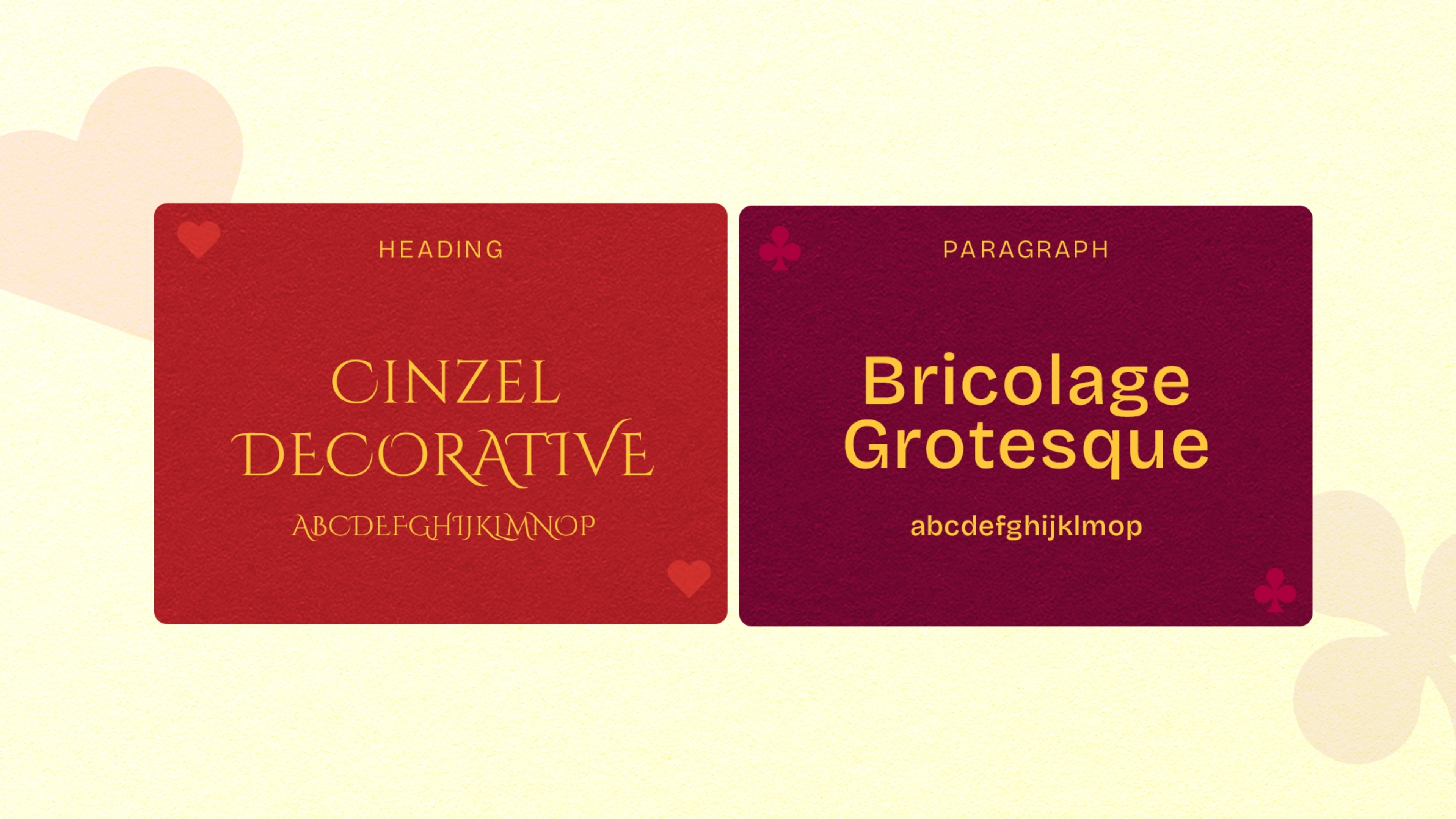
Most premium chocolate brands stick to the same idea of “luxury” -dark backgrounds, gold accents, and elegant fonts but without a real concept linking everything together. They look good, but they don’t mean anything. The challenge was to build a chocolate brand with a strong central idea that drives every decision, from flavour naming to visuals. It needed a world, a concept/theme, and symbols people can recognise instantly, so each bar isn’t just another “premium chocolate,” but part of a bigger story you actually remember.
Most premium chocolate brands stick to the same idea of “luxury” -dark backgrounds, gold accents, and elegant fonts but without a real concept linking everything together. They look good, but they don’t mean anything. The challenge was to build a chocolate brand with a strong central idea that drives every decision, from flavour naming to visuals. It needed a world, a concept/theme, and symbols people can recognise instantly, so each bar isn’t just another “premium chocolate,” but part of a bigger story you actually remember.
Most premium chocolate brands stick to the same idea of “luxury” -dark backgrounds, gold accents, and elegant fonts but without a real concept linking everything together. They look good, but they don’t mean anything. The challenge was to build a chocolate brand with a strong central idea that drives every decision, from flavour naming to visuals. It needed a world, a concept/theme, and symbols people can recognise instantly, so each bar isn’t just another “premium chocolate,” but part of a bigger story you actually remember.
Solution
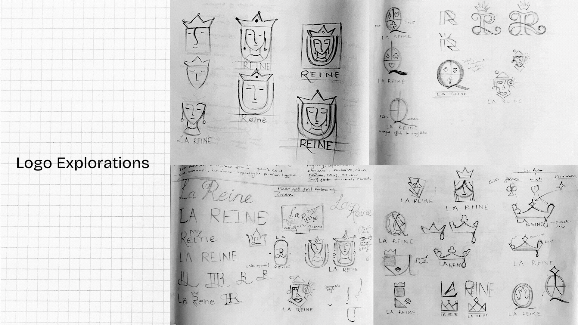
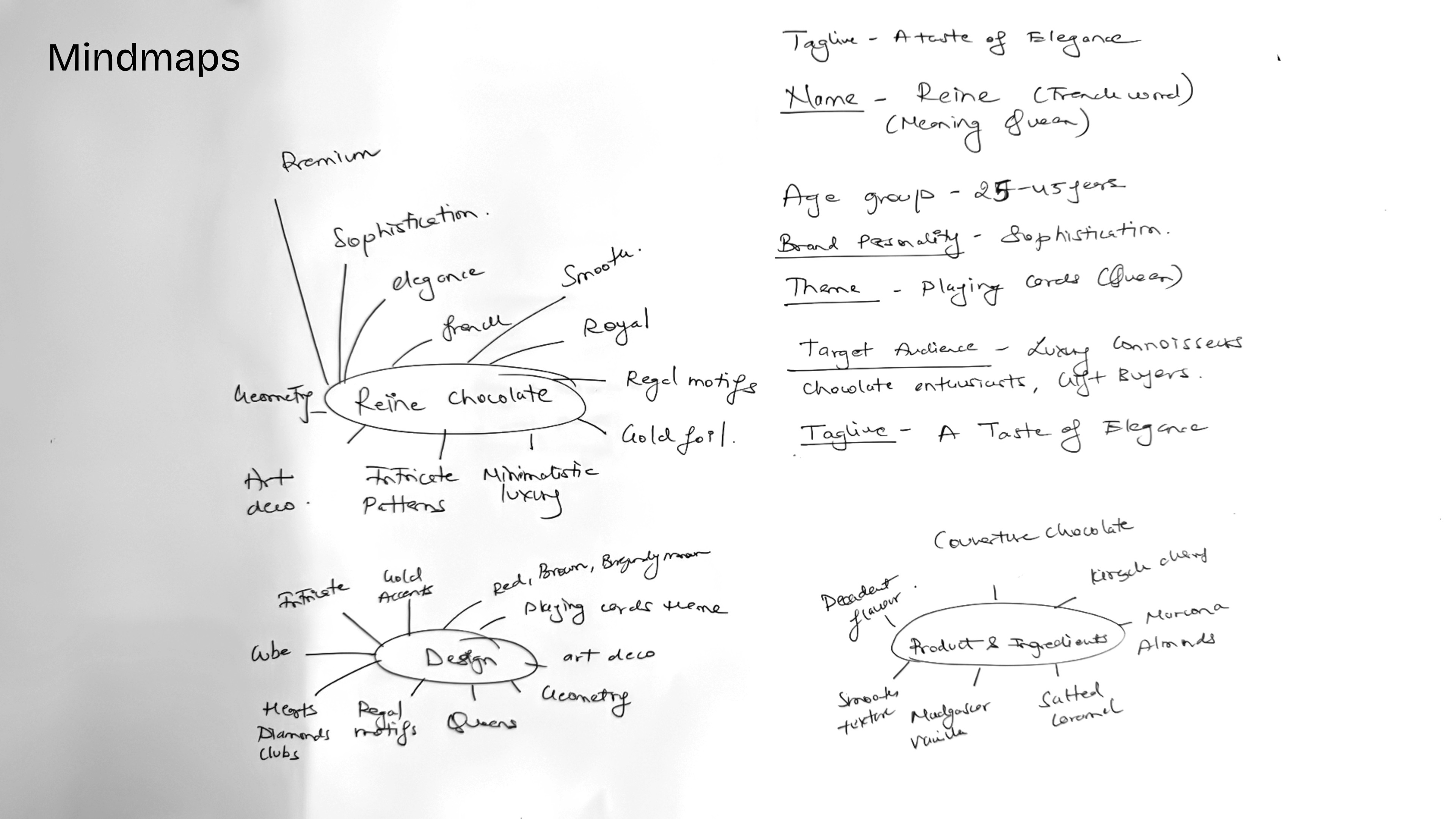
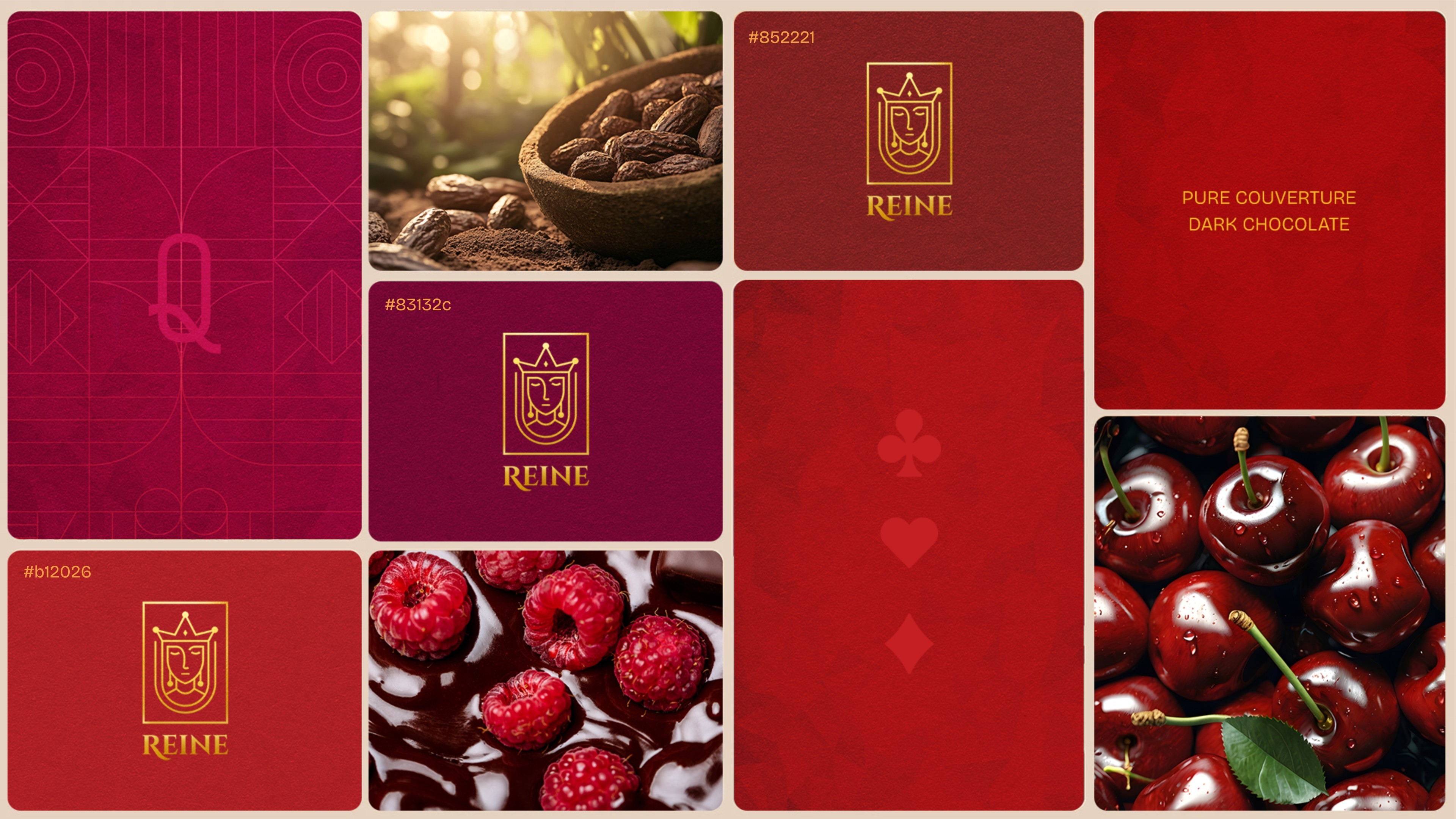
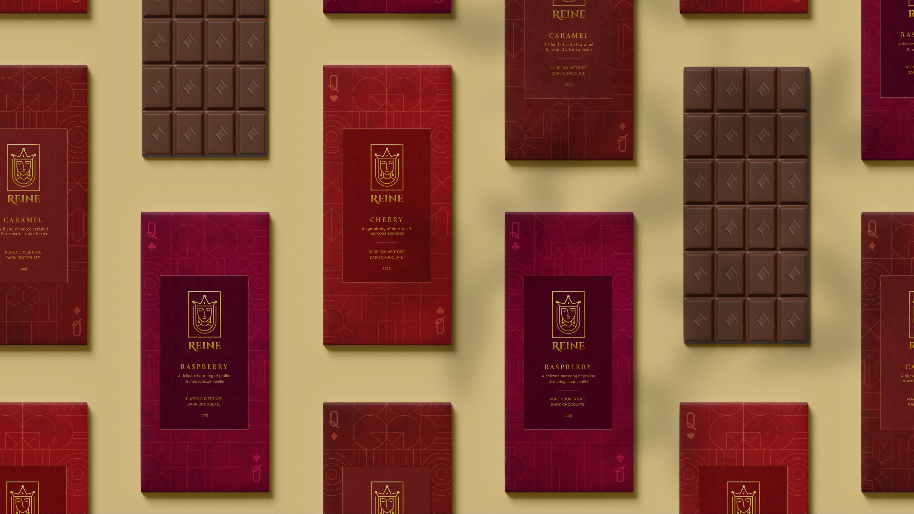
I created a chocolate brand built around a clear story-the Queen of cards. Every design decision comes from this concept: the flavours are named like characters, the packaging uses royal symbols, and the campaign ideas feel like moments in a high-stakes game. Instead of just looking “premium,” the brand communicates a world you can recognise instantly. This makes each bar part of a bigger story, not just another luxury chocolate on the shelf.
I created a chocolate brand built around a clear story-the Queen of cards. Every design decision comes from this concept: the flavours are named like characters, the packaging uses royal symbols, and the campaign ideas feel like moments in a high-stakes game. Instead of just looking “premium,” the brand communicates a world you can recognise instantly. This makes each bar part of a bigger story, not just another luxury chocolate on the shelf.
I created a chocolate brand built around a clear story-the Queen of cards. Every design decision comes from this concept: the flavours are named like characters, the packaging uses royal symbols, and the campaign ideas feel like moments in a high-stakes game. Instead of just looking “premium,” the brand communicates a world you can recognise instantly. This makes each bar part of a bigger story, not just another luxury chocolate on the shelf.
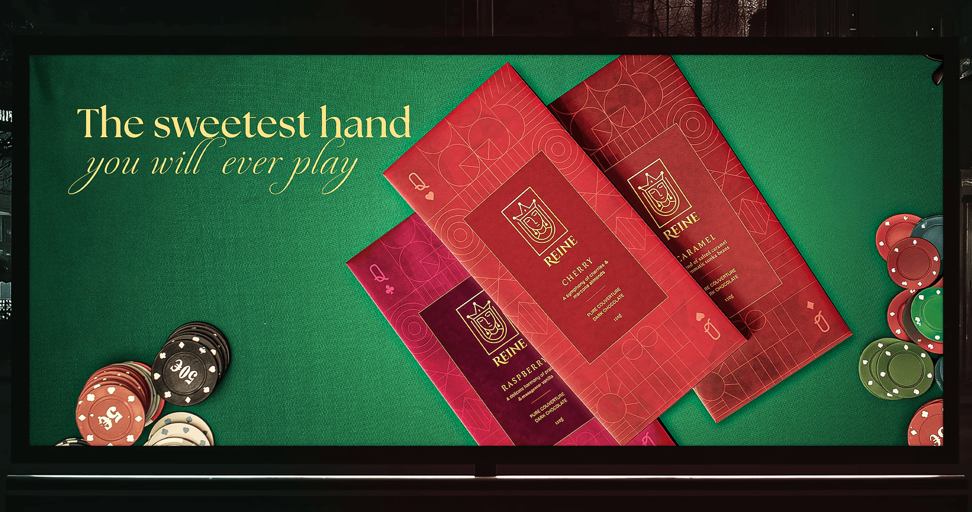
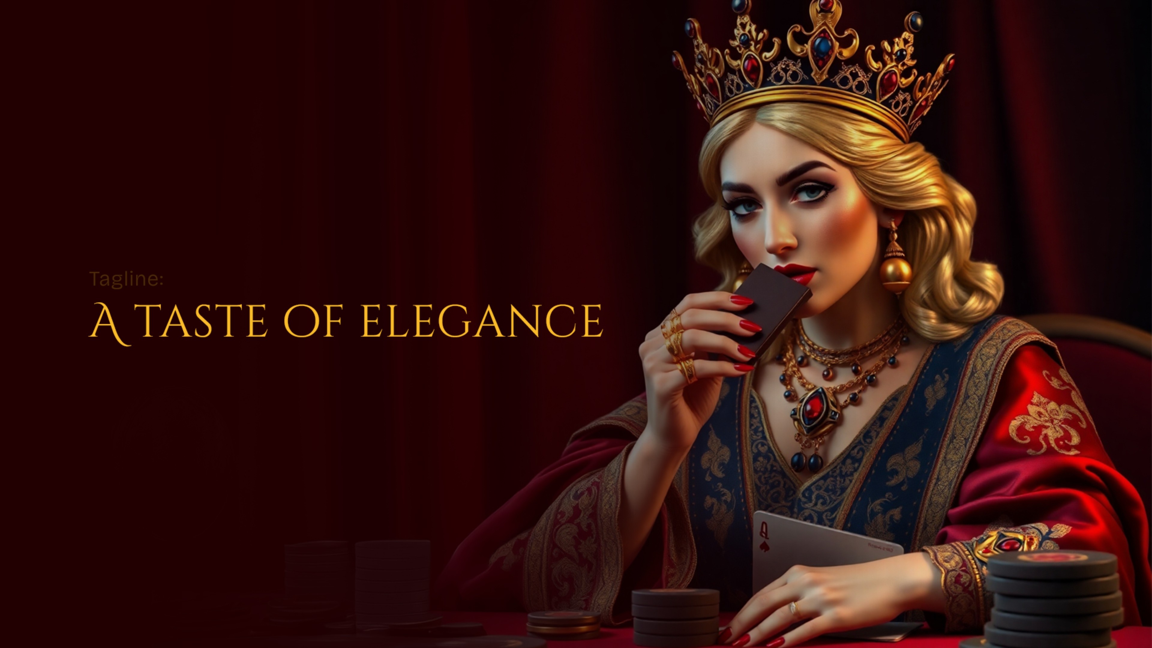
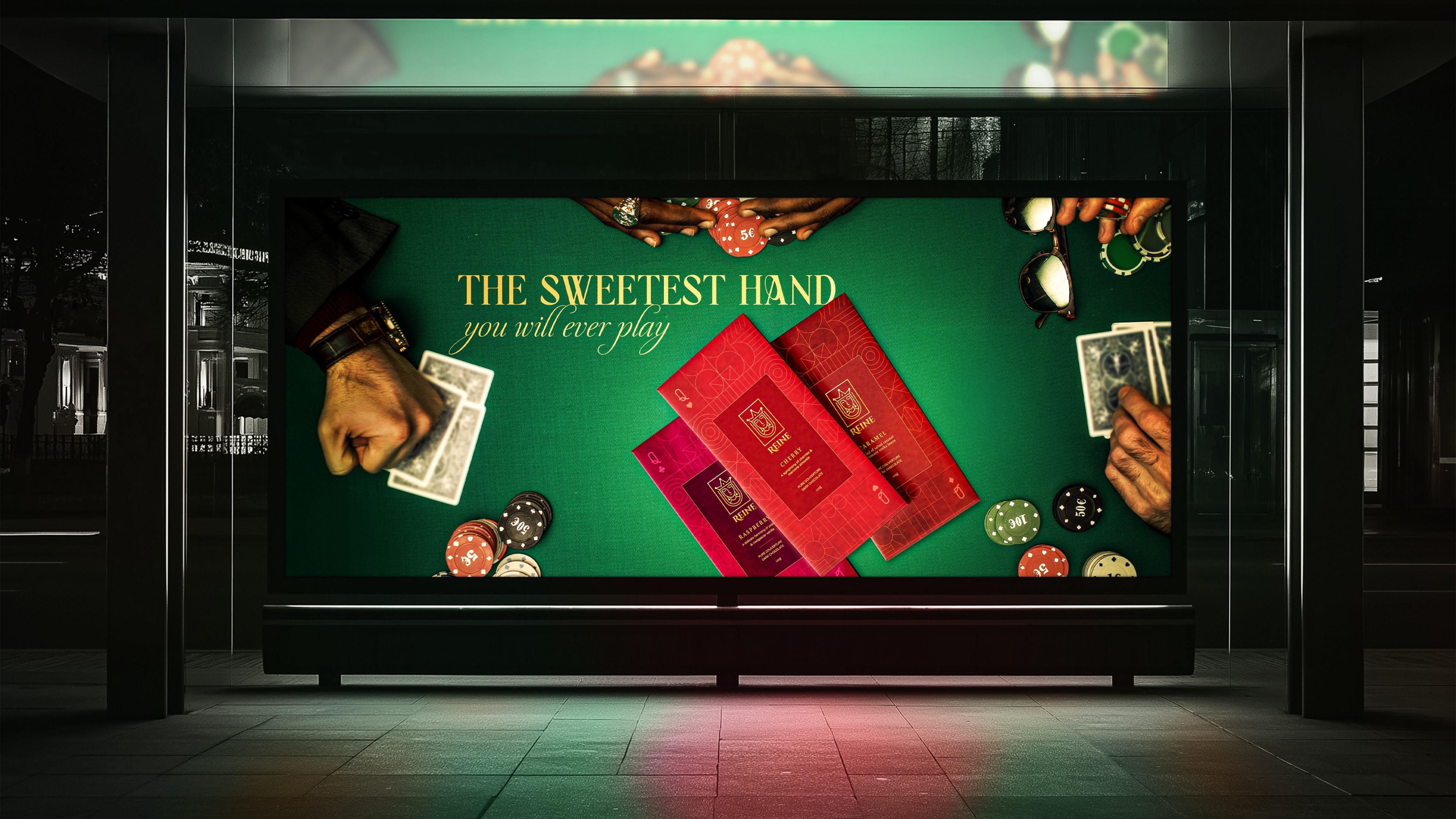
Welcome to the house of queens
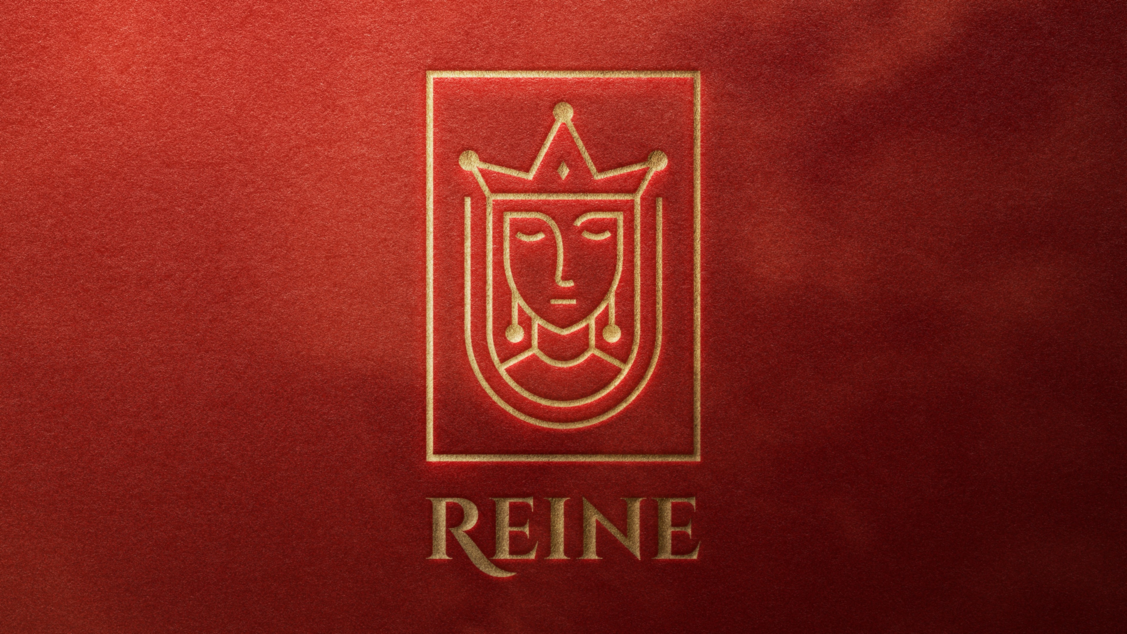
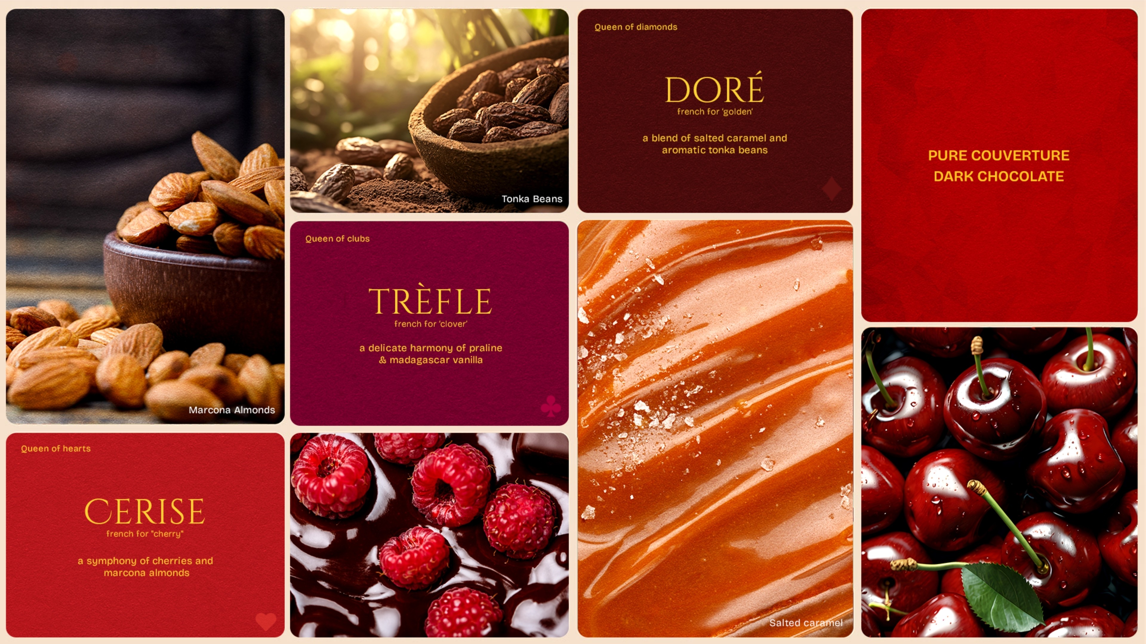
Reine Chocolate is inspired by the world of classic playing cards, especially the Queen - a symbol of power, elegance, and control. The idea began with a simple thought: chocolate shouldn’t just taste good, it should feel like a royal experience. Each flavour is paired with dark chocolate and premium ingredients to create a rich, memorable bite.
The name Reine, meaning “Queen” in French, represents sophistication, confidence, and luxury. Just like in a winning poker hand, Reine Chocolate is all about making bold choices and enjoying moments of indulgence. The flavours are crafted to feel refined - from kirsch cherries and Marcona almonds to smooth caramel and raspberry, each bar is designed to offer a taste of elegance.
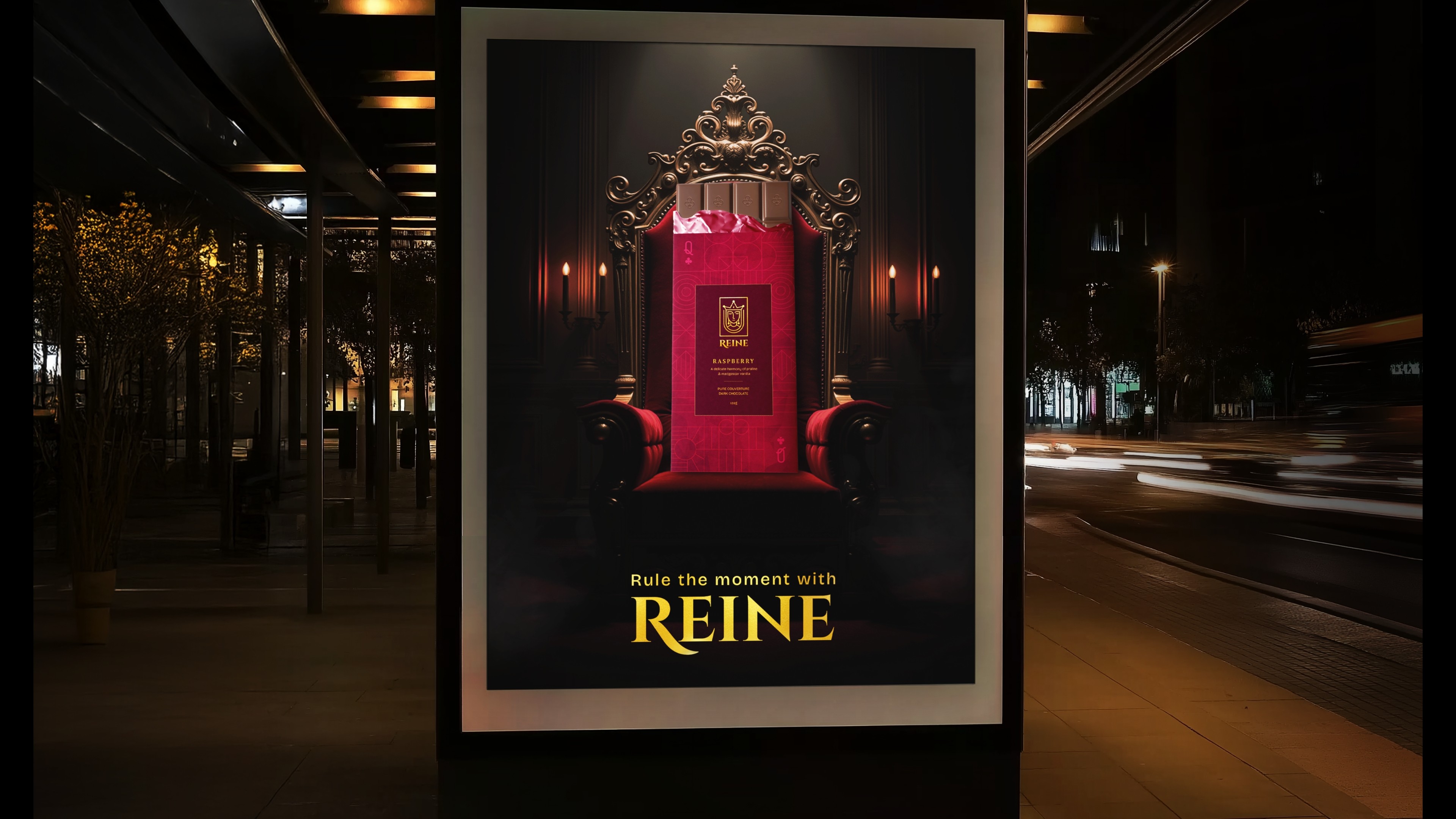
Reine Chocolate invites people to treat everyday life like a celebration, to “rule the moment” and savour every bite. It blends craftsmanship, premium ingredients, and a regal theme to create a chocolate that stands out - not just as a sweet, but as an experience.
Welcome to the house of queens
Reine Chocolate is inspired by the world of classic playing cards, especially the Queen - a symbol of power, elegance, and control. The idea began with a simple thought: chocolate shouldn’t just taste good, it should feel like a royal experience. Each flavour is paired with dark chocolate and premium ingredients to create a rich, memorable bite.
The name Reine, meaning “Queen” in French, represents sophistication, confidence, and luxury. Just like in a winning poker hand, Reine Chocolate is all about making bold choices and enjoying moments of indulgence. The flavours are crafted to feel refined - from kirsch cherries and Marcona almonds to smooth caramel and raspberry, each bar is designed to offer a taste of elegance.
Reine Chocolate invites people to treat everyday life like a celebration, to “rule the moment” and savour every bite. It blends craftsmanship, premium ingredients, and a regal theme to create a chocolate that stands out - not just as a sweet, but as an experience.
year
2025
year
2025
year
2025
year
2025
timeframe
1 month
timeframe
1 month
timeframe
1 month
timeframe
1 month
tools
Adobe Photoshop & illustrator
tools
Adobe Photoshop & illustrator
tools
Adobe Photoshop & illustrator
tools
Adobe Photoshop & illustrator
Project Category
Branding & Packaging
Project Category
Branding & Packaging
Project Category
Branding & Packaging
Project Category
Branding & Packaging
see also
see also